Francisco MANGADO
 
fM
FRANCISCO MANGADO

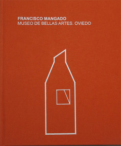
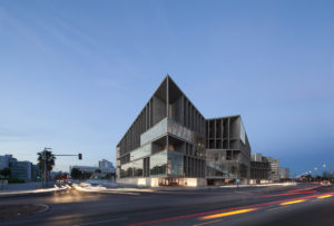
Fine Arts Museum of Asturias+

2006-2015

Oviedo-Spain

5.024 m2


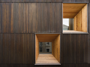
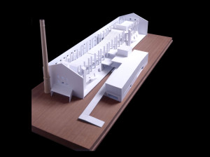
This proposal started off with deliberations on the project at large, including the future of the Velarde and Oviedo-Portal mansions. It could not be any other way. Only through consideration of the larger scheme of things can there be any guarantee of an optimal operational future for an institution as important as this one.
We also understand that the proposed new layout makes it possible to organize construction work in phases, and in such a way that museum operations are at no time interrupted.

The objectives/guidelines of the architectural action are:

-An image and identity that, over and above the historic- architectural substratum of the site, will give the Fine Arts Museum of Asturias its own uniqueness as an institution.

-Respect for that historical substratum.

-Diaphanous spaces that facilitate exhibition montage and make it possible to contemplate artworks with sufficient perspective, unlike how things are at present.

-Clear-cut internal functioning.

-Clear-cut accesses.

-A substantial increase in exhibition floor area.

Plaza Alfonso II el Casto, 10, 33003 Oviedo, Asturias, España

VII ENOR Elevators Awards
23-05-2017
Finalist project: Fine Arts Museum of Asturias in Oviedo.
EUmiesaward
23-12-2016
European Union Prize for Contemporary Architecture – Mies van der Rohe Award 2017. The Asturias Museum of Fine Arts has been nominated for the E.U. Prize for Contemporary Architecutre – Mies van der Rohe Award 2017. The European Commission  and the Mies van der Rohe Foundation announced the list of 356 works vying for the European Union Prize for Contemporary Architecture – Mies van der Rohe Award 2017. The jury will select 40, then shortlist the 5 that it will visit in April.
RIBA AWARDS FOR INTERNATIONAL EXCELLENCE
27-10-2016
The Fine Arts Museum of Asturias has been received the RIBA Award for International Excellence by the Royal Institute of Brithis Architects (RIBA) to the most transformative building which demonstrates visionary, innovative thinking, excellence of execution, and makes a distinct contribution to its users and physical context.
Archmarathon Award 2016
15-05-2016
Archmarathon Award 2016. Category ‘Arts & Culture’. First Prize: Fine Arts Museum of Asturias. 
RIBA Award for International Excellence 2016
10-05-2016
RIBA Award for International Excellence. The Asturias Fine Arts Museum is one of 30 projects chosen to be visited by members of the RIBA Awards Group and considered for the RIBA Award for International Excellence.
Trophée Archizinc 2016
24-04-2016
Trophée Archizinc 2016. Public Building category. Firts Prize: Fine Arts Museum of Asturias.
Architizer Awards 2016
01-04-2016
Architizer Awards 2016. Finalist project: Fine Arts Museum of Asturias
XXIII Premio 'Asturias' de Arquitectura
18-03-2016
Asturias Architecture Award 2016. Extension Fine Arts Museum of Asturias. Given by the Asturias Institute of Architects. 
Civic Trust Awards 2016
01-03-2016
Civic Trust Awards 2016.Awarded Project: Fine Arts Museum of Asturias
Archmarathon 2016 : Arts & Culture Winner
05-2016
Archmarathon 2016 : Arts & Culture Winner
12-2015
06-2015
06-2015
05-2015
02-2015
p.68-79
04-2019
ISSN: 1828-4450
p.86-89
10-2017
ISSN: 1579-9832
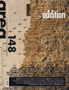
Area #148 : Addition
p.72-81
09-2016
ISSN: 0394-0055
p.167-176
01-2017
ISSN: 1650-1330
p.120-121
09-2015
ISBN-10: 9783871818981
p.26-43
09-2015
ISSN: 2340-8677
p.16-24
07-2016
ISSN: 2484-1048
p.15-21
07-2016
ISSN: 2420-9090
p.19-25
04-2016
ISSN: 2421-2687
p.18-21
03-2015
ISSN: 0012-5377
09-2015
Amag editorial S.L.
La galerie d'architecture Exhibition Catalog
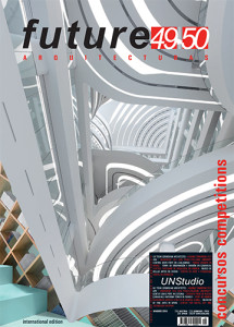
Future Arquitecturas #41-42
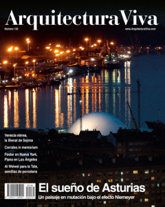
Arquitectura Viva #132: El sueño de Asturias
12-2010
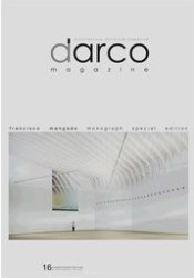
Darco Magazine, Francisco Mangado Monograph Special Edition #16
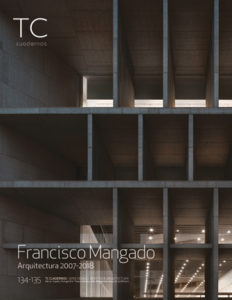
TC Cuadernos - Concursos #85
AV Proyectos #019: Water
Future Arquitecturas #7
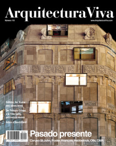
Arquitectura Viva #110 Pasado Presente
01-2007
Municipal Auditorium of Teulada
2004
/
2011
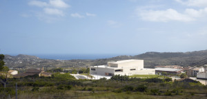
Teulada-Moraira is one of those municipalities divided into two separate physical units. It could well have been called ‘upper’ and ‘lower’ Teulada, or ‘upper’ and ‘lower’ Moraira. The built area of Teulada is in the mountain, and that of Moraira is further down, following a valley of some five kilometers along the Mediterranean shores.The building of the new auditorium acts as a hinge between the two physical areas of the municipality. A reference that allows seeing and being seen from both spots. As far as hall types and complementary uses are concerned, the program is simple. The organization and layout of the pieces undergoes a total geometric and spatial transformation towards the southern facade that, being oriented to the sea, becomes the most singular and significant element of the project. Its depth gives it a sense of architectural section that urges to follow a three-dimensional interpretation (in terms of space), instead of a restricted two-dimensional scale. In metaphorical terms this facade evokes topography similar to a beach of stone that, from a distance, and with all its depth, appears to merge into the sea. In more practical terms, its deep and cracked geometry emerges from the study of the impact of the sun and the geometry it generates, especially during summer, so its final configuration aims to avoid the impact of sunrays in the interior. The base of this “facade” is a large exhibition hall that, as a sort of “cellar” that is softly lit by the rays that manage to make their way through the thick vertical concrete grille, fresh in summer and warm in winter, may provide the southern facade - based on more conceptual references - with a functional argument.The building shall be seen from a distance as a volume covered in tiles, like fish scales. Matte tiles that will be attached to the concrete walls. The shifts, setbacks and projections of the facade that is oriented towards the sea will be made of sandblasted marine aluminum sheet. Different spots of light, made of optic fiber, will be a value added to the volume seen from afar or from the water.
Municipal Exhibition and Congress Center of Ávila
2001
/
2009
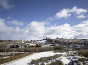
Ávila is a dense and intense city. Its layout, centered and delimited by the smoothly crafted city walls, confirms this perception. Actually, Ávila itself is a rock amid the harsh landscape surrounding it.Within such thickset contexts, any clear space takes on an added value much related to the concept of contrast or of boundary. In such cases a square serves as a means to free up interior space, and externally, to articulate the relationship with the city walls. The area outside the walls belies the origin of these voids that organize the space between the city inside, and the city outside. The presence of an open space at the foot of the walls, where the new Congress Center shall go up, allows thinking of new systems to structure the urban space.During the project design the guiding principles were conceptual density, generosity in the way of occupying space, and exploitation of the topographical features of the site. The landscape studded with granite pieces, both formally and spatially, provided the references needed.The Municipal Congress and Exhibition Center is aimed at becoming a meeting place to celebrate different kinds of events, a levelled area or plaza at the edge of the walls. The main level of this area is matched up with the highest point of the plot, so that its extension generates a large interior void that shall house, without excavation, the required uses.The building basically takes up the northern side of the new public space, delimiting along with the walls the new square. In keeping with the contours of the site, the project combines two different geometries: the most orthogonal and elongated space contains the auditoria and main halls, while the most precipitous and uneven one contains the exhibition spaces.Entry to the complex is clear and easy: the main auditoria are reached from the square and from the higher part of the seating area, which allows to get a quick grasp of the interior space; and the exhibition areas have an independent entrance from the incisions on the platform in the eastern boundary and, since all the different areas are connected under the square, they can also be reached from the interior of the building. From a formal and constructional point of view, the project draws inspiration from the evocative strength of the landscape, from the granitic mass that pervades everything.The volumes are meant to be seen from afar, high up from the walls like a sculpture carved out of the terrain. It is a juxtaposition of granite volumes, summed up in one piece, a more orthogonal one, cut and carved in a precise manner, and another more abrupt and topographical piece that covers the exhibition volume. For this reason the roofs shall be designed to smoothly extend the vertical surfaces. These folds generate the incisions through which natural light floods the interior, also allowing independent access to this area.
Spanish Pavilion Expo Zaragoza 2008
2006
/
2008
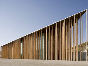
Evoking the space of a forest, or of a group of bamboos on a surface of water, has been the main aim of the project. On the one hand there is a desire to create a building mechanism able to generate incredible possibilities from the point of view of energy logic and environmental awareness, an essential and symbolic aspect for the future Spanish Pavilion at the International Exposition of Zaragoza. But on the other hand, one of the most attractive spaces one may have deal with, both in terms of matter and light, is transferred to the field of architecture. Changing spaces, spaces full of hints and nuances where concepts such as verticality and depth play an essential role.Is the artificial reproduction of a natural process possible? This is an old, unattainable aspiration of architecture. However, in this case this approximation is possible because the geometric strength of the metaphor performs in our favor, and the image suggested gives the proposal a symbolic charge that is necessary in the case of a pavilion, that of Spain to be more precise, for an international expo. The metaphorical allusion, in which water is present through the landscape of reference, is strong and evident.

 Construction. Pieces.
The process is clear and simple. The vertical elements may be manufactured in a workshop. They have a metallic core clad in pieces made of clay that, in contact with water, absorbs it generating air currents that act as microclimates (see corresponding project descriptions and schemes).Its bracing, to ensure structural unity, is very simple and based on the same method used in many nurseries to maintain trunks vertical.Roof.
A huge roof, supported off by all these profiles, covers the pavilion. It is a useful roof because its width (three meters) allows to accommodate energy saving systems (see project description) and, at the same time, adjust light with the help depth, which makes the sunrays, very controlled, draw their trace and reflection on the columns and the water surface at the base. The roof is clad in panels of recycled wood shavings.Exhibition Spaces.
They are carved out voids. Their slabs hang from the large roof, braced only to the columns. They are built with beams of recycled wood shavings and resin. The exterior enclosure is also of glass. A system of mobile partition walls will be anchored to the structure, with the visual and acoustic insulation needed for the development of certain exhibitions and for the future cinema center.
Congress Center and Hotel. Palma de Mallorca
2005
/
2017
The scheme for the new Congress Center and Hotel of Palma may be explained as two large stretches that unfold following the north and south boundaries of the plot fronting the sea. Two stretches of wall devoid of physical density but endowed with functional and architectural relevance. The one facing northwards contains all the facilities that complement the main program, as well as the supplies and staff access areas. But the most important one, the one facing south and towards the sea, shall be a deep facade, a facade-space formed by a dense vertical structure that evokes the density of the walls (of four meters in depth), shelters the interior from the direct entry of light and yet allows to accommodate staircases (in some cases escalators), which afford views of the sea horizon as they go up or down. These connecting elements reveal their presence towards the exterior in the form of large glazed screens set in the overall fabric.The depth of the façade on the lower floors allows to fit in the accesses, thereby highlighting the transition between interior and exterior and also accommodating retail areas that, located right next to the exhibition spaces, look onto what will become the new seafront boulevard.The linear distribution of the program enables the different areas of the building to perform and be used in a relatively independent way. The public accesses are located basically on the facade that extends Manuel Azaña Street, underscoring the relevance of the same, and in the seafront promenade in the case of the auditoria, and along this last one for the exhibition areas.On the one hand, the project design aims to make the most of the light of Palma generating a series reflections and defined shadows, and, on the other, it plays with the image of a large beached fish, of well-defined forms and geometries but with a subtle transition that manages to explain the continuous geometry of the roof itself, only interrupted by the suspended garden of the restaurant that rises as a large lookout with direct views onto the sea and the coastal promenade.